Redesign of U.S. Department of Labor

Purpose of dol.gov

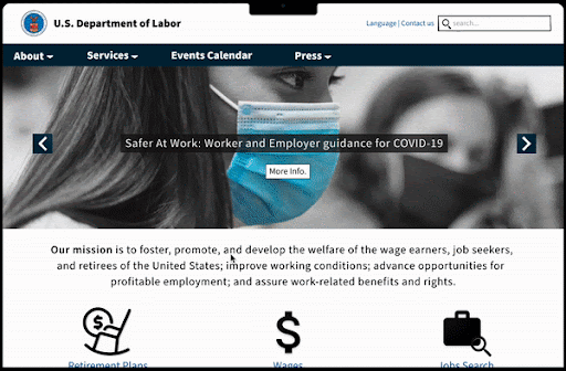
The purpose of dol.gov is to cultivate, promote, and develop the welfare of American wage earners, job seekers, and retirees. The website offers legal solutions and actions to improve working conditions; to expand employment options that are profitable; and to ensure rights and benefits associated with the workplace.
Overview
There are flaws in the DoL's current website that hamper users' ability to navigate and find information. A redesign of the website's main pages was envisioned to support the DoL's mission and meet current concerns about the site's look, accessibility, and functionality.
Many services are being hidden in webpages due to the homepage mainly displaying articles and news. Lack of clear explanation of the purpose of the website upfront.
My Role: UX/UI Designer
Tools: Figjam, Figma, InVision, Photoshop, Zoom
Deliverables: User & Competitor Research, Heuristic Evaluation, Card Sorting, Navigation Testing, Accessibility Analysis, Style Guide, Digital iOS & Desktop Wireframes, Clickable Figma Prototypes
Website Analysis
-
1) Navigation Bar
-
includes drop down menus that has overwhelming number of options
-
-
2) Search Field
-
takes the user to links (both, internal and external) related to what they searched for.
-
-
3) Narrative Section
-
focal section of the website, filled with how the DOL has helped the people
-
-
4) News Section
-
all news articles are related to dol's purpose
-
-
5) Call to action button

-
6) Social Media Activity
-
Shows DOL's activity on Twitter. Users can easily go on their twitter profile just by clicking any of the posts.
-
-
7) Quick Links

-
8)Blog
-
mainly includes articles about hypothetical situations and their solutions
-
-
9) Address Footer
-
10) Second Navigation Section
-
11) Secondary Footer

Heuristic Evaluation
The website looks modern and has a clean, direct design. However, there are a lot of information that aren’t necessary to it’s purpose are placed in the homepage. On the other hand, the information that speak to the website’s purpose are buried in other webpages which isn’t convenient for a website that is targeting people from different age groups. As a result of the data collected, the website will cater to different age groups and emphasize its purpose.
Accessibility Analysis
The website looks modern and has a clean, direct design. However, there are a lot of information that aren’t necessary to it’s purpose are placed in the homepage. On the other hand, the information that speak to the website’s purpose are buried in other webpages which isn’t convenient for a website that is targeting people from different age groups. As a result of the data collected, the website will cater to different age groups and emphasize its purpose.
However, using the accessibility tool on adobe.color, the contrast checker fails when setting the ‘WCAG 2.1 Level’ to ‘AAA’ due to the font size being 17px.


User Testing & Key Findings
5 Tests were conducted, 3 users were overwhelmed by the number of options in the drop down menu, so they took the short route and searched for ‘retirement plans’ as requested. All users were confused by the purpose of the website since it doesn’t communicate this clearly on the homepage.
From there, this prioritization matrix was born

Users found the navigation bar to be the most problematic part of the website during user testing
Redesigning the main nav bar to clarify each selection and to tie it to DoL’s purpose and services.


Currently, the drop-down menu is crowded and users complain that it's difficult to navigate.
By categorizing the drop down menu better, it will become easier to navigate and narrow the choices.
The footer navigation also feels crowded and should be redesigned to reflect the main navigation bar.
Phone View


User Testing Navigation Bar & Footers
A total of four tests were conducted focusing on navigation bars/menus. Two users used the desktop version, while the other two used the mobile version. The most frequently heard phrases during all of the testing sessions were:

The updated design became clearer to me once I began card sorting
Before
After
Redesigning the Navigation Bar
To simplify the user's experience, I've decided to place all of dol's services on one page. The services will also be categorized based on employment status. Considering user testing findings, I've renamed the 'Topics' page to 'Services' in order to clarify and emphasize their purpose.
'Agencies' will be removed from the main navigation bar since it includes links to offices outside the DOL. Users will, however, be able to access this through the footer menu should they need more information from a specific office.
Since 'Forms' is a part of 'Services,' it'll be under that category. Since the events include info sessions that will benefit the user, I'll be highlighting 'Events Calendar' in the main navigation bar.

Sitemap

Wireframe (Phone)
Prototypes

Wireframe (Desktop)

Design Decisions
To maintain the website’s full accessibility, I ensured that the redesigned color scheme passed the following accessibility tests. My font choice was 'Source Sans Pro' since it is dyslexic-friendly. I also made sure the font size never went below 17pt.

5-Second-Test: Key Findings
After the designing stage, I've conducted 5-usability tests and have gotten positive feedback such as:
There was a strong appreciation for the website's mission statement from the start
Both the desktop and mobile versions of the site were easy to navigate and that was indicated by how users managed to interact with the site in a short span of time.
“The nav bar looks much better” was said in one way or another by the users who use dot.gov
UI Design Tile
